One Too Many Men - Process, Drafts, and Proofs
Research Project Statement Excerpt:
“My PhD research continues my ongoing theme of sexed and gendered identities explored from the phenomenological philosophical perspective. The research journey has led me, through lived experiences and via reflection, to feel it was urgently important to address the especially male phenomena of suicide. I believe that the tragically high numbers of men that die by suicide reveals how both biological and socio-cultural factors contribute to the fragility of the construct of masculinity…”
The full text of Matters of Life and Death, 2024-2025: The plight of male suicide and the failing foundations of male identity is available to read toward the end of the About the work page (structured chronologically) of this site.
I began attempting to make this series with the idea of exploring the ritual form of suicide undertaken either voluntarily or as a punishment by Samurais. I was familiar with the term harakiri which is often used in western media but a little research quickly proved that the correct term for the ritual act is Seppuku (the term harakiri is just a description of the act). My rational for doing this is that I knew throughout the series of images I wanted to both represent different practical methods of suicide but to also explore some of the motivations and self-justifications for undertaking such tragic acts. In referencing the ritual of Seppuku I was both able to represent suicide by cutting or use of a blade but also the notion that the protagonist felt so ashamed that their twisted logic led them to believe that taking there own life was an honourable act. This concept resonated deeply with me as what I have since come to understand as my sometime dysregulated emotions and now formally diagnosed ADHD have made it difficult for me to form and sustain healthy relationships and in the worst case kept me too separate from my beloved children. Below is my first test of making such an image, followed by reflections that led to a second iteration.
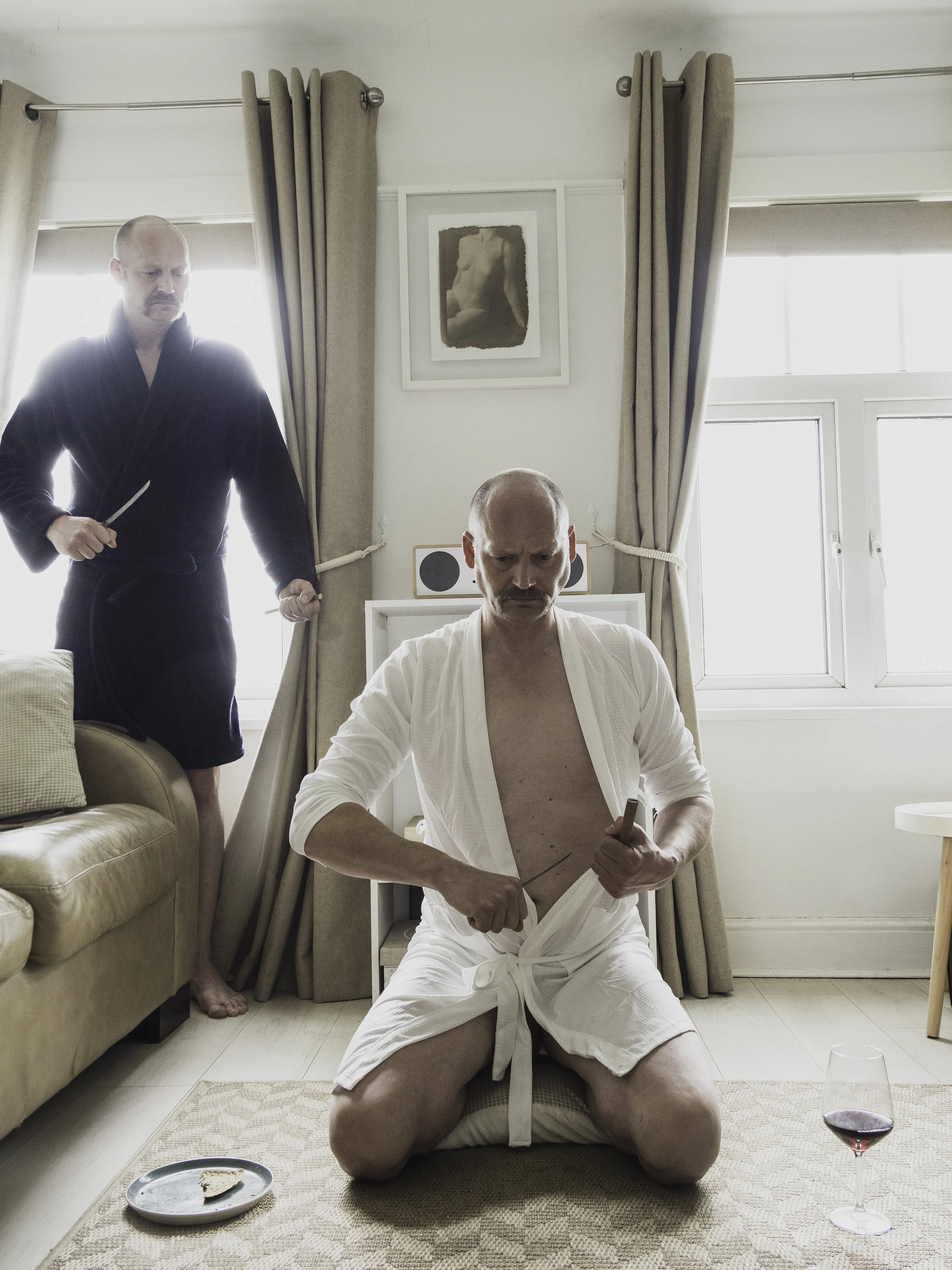
The Honourable - First draft
As outlined before I wanted to reference the Seppuku ritual in this image. According to the ritual traditions, I bought and used a white bathrobe to reflect the white Kimono that the Samurai would have worn, I included in the image items that also represent the last meal and tea ceremony which obviously also have connotations of the body and blood especially in christian tradition. The Samurai’s “second” who will make the final and fatal cut is wearing a dark robe as depicted in some of the reference images of Seppuku that I saw. I felt that there was potential in the image but that it fell short in a few ways. Firstly the harsh backlighting reduced the overall image quality due to the extreme dynamic range (although the bleaching around the secondary character had it’s own charm) so I knew I wanted to re-shoot, retaining the backlighting (shooting late afternoon towards the south facing windows) but using flash as well to better balance the image. I also realised that I had omitted a reference to the Seppuku ritual that I had meant to include which was some sort of representation of the “death poem” written by the Samurai that would usually feature in the ritual as well. Below is my second test incorporating these changes and once again is followed by my reflections.
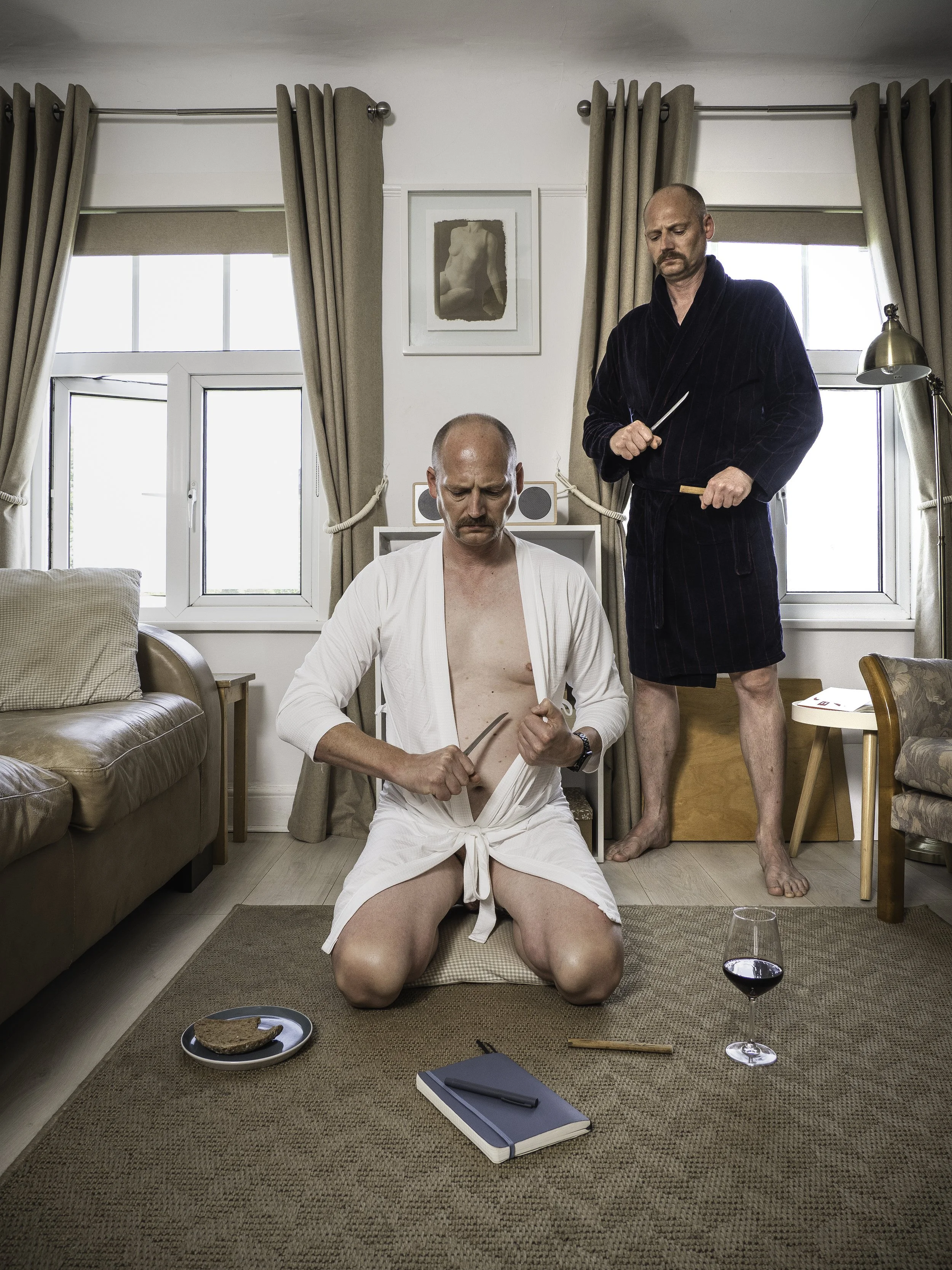
The Honourable - Second draft
Adding flash provided a more balanced, detailed and higher quality image. I also felt that adding the notebook and pen with it’s symbolism of history, self reflection and culture added a further dimension to the image. However, spending a few days “living with this second draft, returning to view it and consider repeatedly over a period of time, I felt it was still not what I wanted. Ultimately I realised that what I found unsatisfactory was the fact that it was a very literal representation of the Seppuku ritual resulting in a scene that was totally alien to normal domestic scenarios. I therefore decided to reshoot again employing all of the learnings from the first two tests.
The Honourable - Third draft
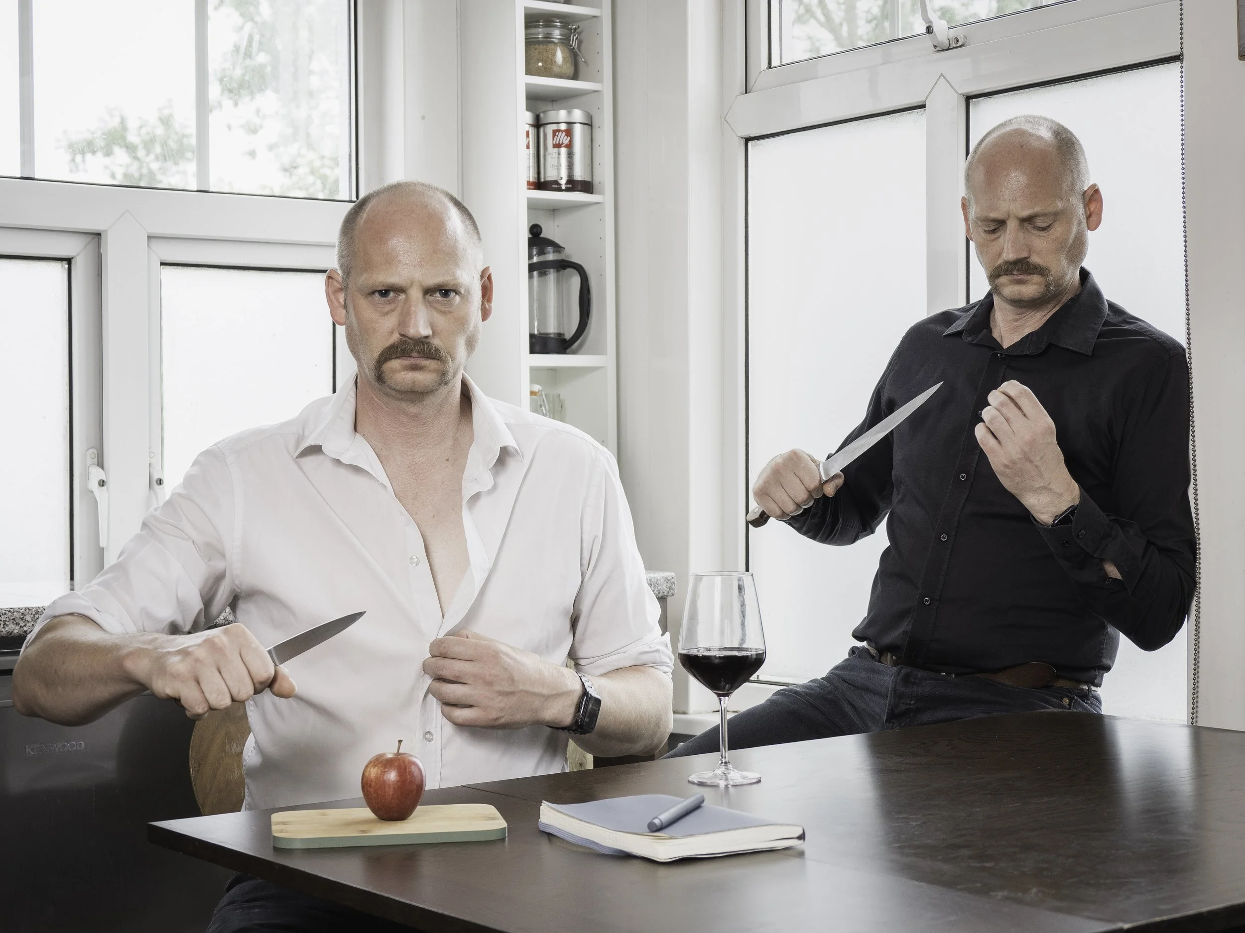
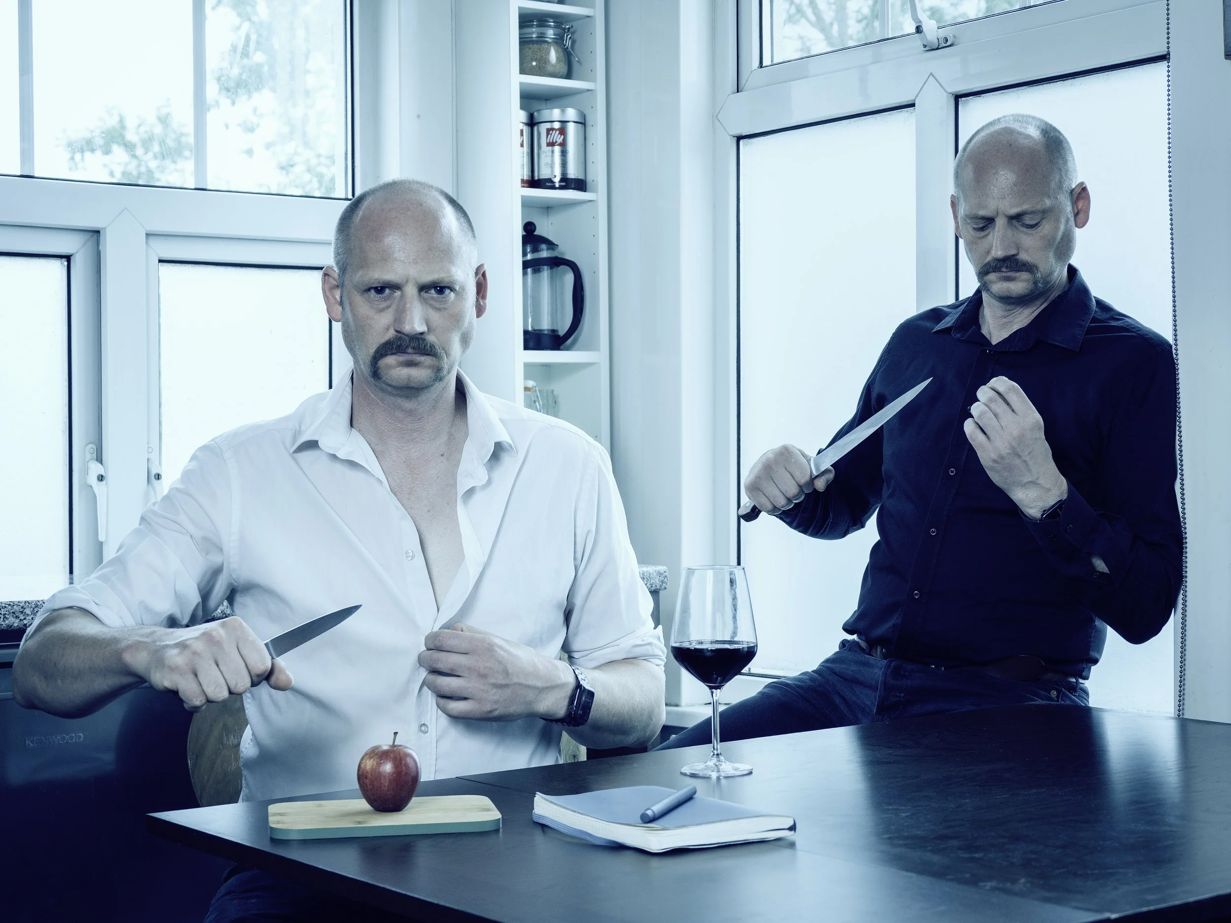
I situated the third shoot in my kitchen/dining area instead of the lounge. This was a more suitable location for the use of knives which I also changed to kitchen knives rather than the miniature samurai sword paper-knife I had used in the previous images as the ritual blade. I also changed the food item from bread to an apple, not only because again it made more sense in the context of the use of a knife, but also because of it’s symbolic value - self knowledge and “the fall from grace”. I also replaced the bathrobes, dressing myself in white and black shirts which in some ways normalise the subjects in their activity but also elevate the symbolism within the image in a way I hadn’t anticipated but very much liked. Again, I needed to live with the image for a while returning to it with fresh eyes each time before I could decide I was happy it was the best it could be considering the material restrictions I faced in production. During this period of reflection it occurred to me that there was a painting from the canon of art had some resonance for me - Breakfast of a Blind Man, 1903 by Picasso from his “blue period” so I decided to make a further blue-oriented edit of the image to acknowledge my perhaps unconscious reference and the situation of my image in the continuum of visual culture (below). Ultimately however, I decided that the first iteration, without the blue tint was my preferred option. The more naturalistic colour tones of the first were more congruent with the rest of the series and as I already had the cultural reference of the Seppuku ritual (as well as rich symbolism) it seemed unnecessary and even affected to shoehorn the additional artistic reference into the same image.

Breakfast of a Blind Man, Picasso, 1903
The Honourable - Final image
Bearing in mind that I wanted to shoot the next image also in my flat and using myself as a model for the sake of simplicity and to prove the concept I thought about what other images I could successfully make in this series. I also thought about how my own struggles to find employment after redundancy had led to self-doubt, rumination, a sense of hopelessness, and ultimately suicidal thoughts. i therefore decided to create the next image based on this experience of work-related trauma and self-evisceration. As I had already made a reference to a historic artwork with the previous image, it also occurred to me that a nod to Rodin’s Thinker would be the ideal reference to integrate into one where use of the intellect was being being depicted whereas my previous image focussed on portraying principles or morals.
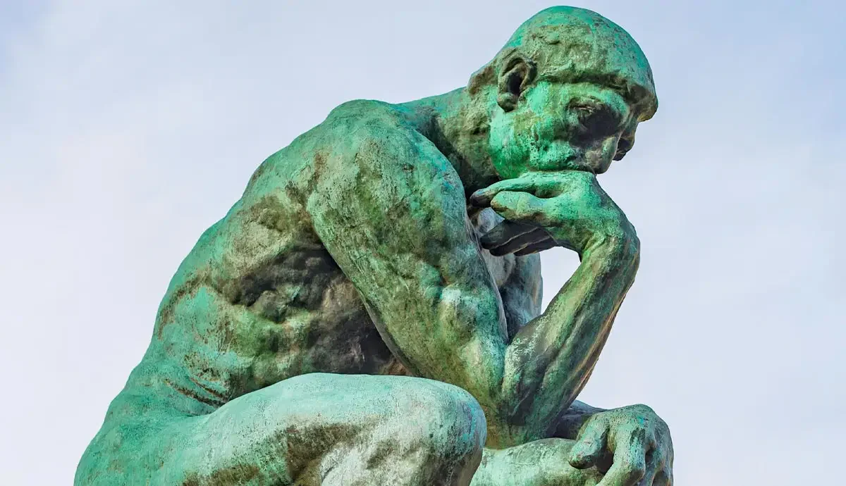
The Thinker, Auguste Rodin, 1904
The (Over) Thinker - First draft
As with the first attempt of the previous image I felt that relying on the available light alone for this image lacked drama and dynamism. I therefore decided that I would reshoot a darker image with fairly subtle flash-lighting on the subjects to better reflect the mood of introspection.
The (Over) Thinker - Second draft
I was still not where I wanted to be with the drama and dynamism of the image but felt I could most likely achieve this by adding further points of flash perhaps also with coloured gels for increased visual interest and more effective story-telling.
Below I have shown the lighting set up I ended up with. In addition to the key light on the subjects at low power and soften by the use of a beauty dish I added three flash guns. One was taped to the computer and had a blue gel attached to mimic the blue light typically emitted such screens. To further units each with an orange gel that provided the warmer light given off by domestic light bulbs were placed either side of the subject and bounced from the walls/ceilings, one on the shelves top left and one on the bookcase to the right of the desk. I also employed the small table lamp situated on the corner shelves in the alcove behind the subjects for further depth.
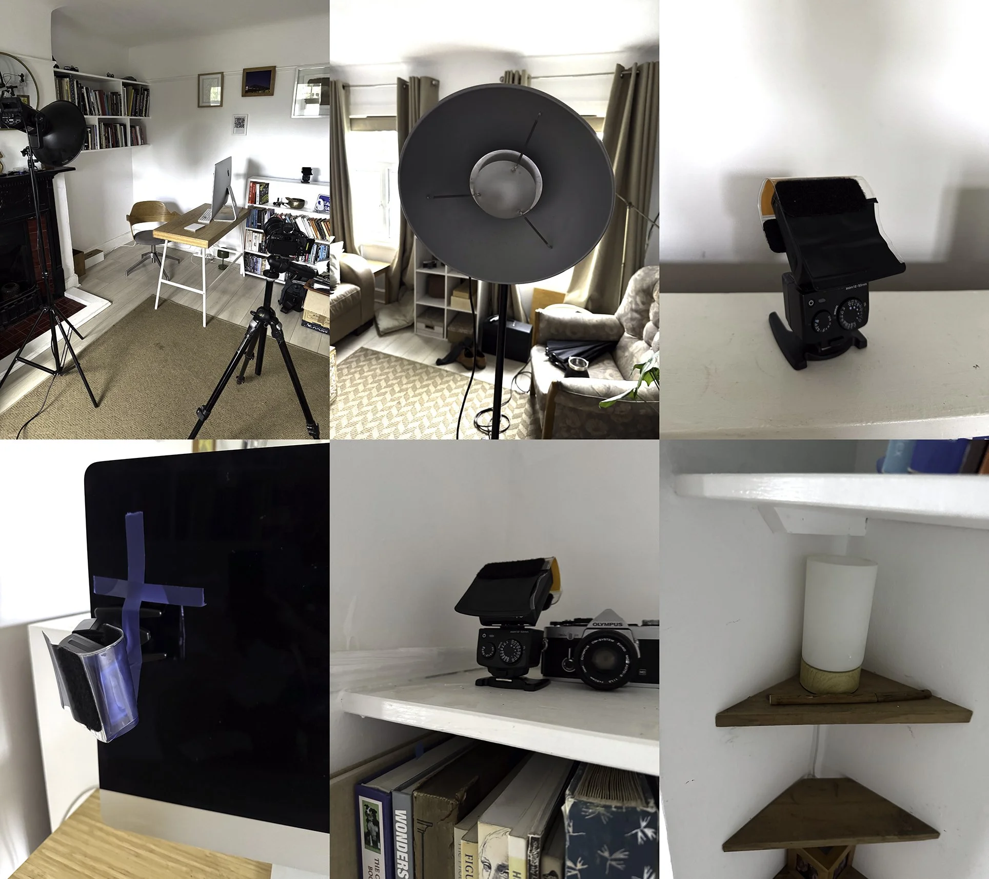
The (Over) Thinker - Set up for third draft
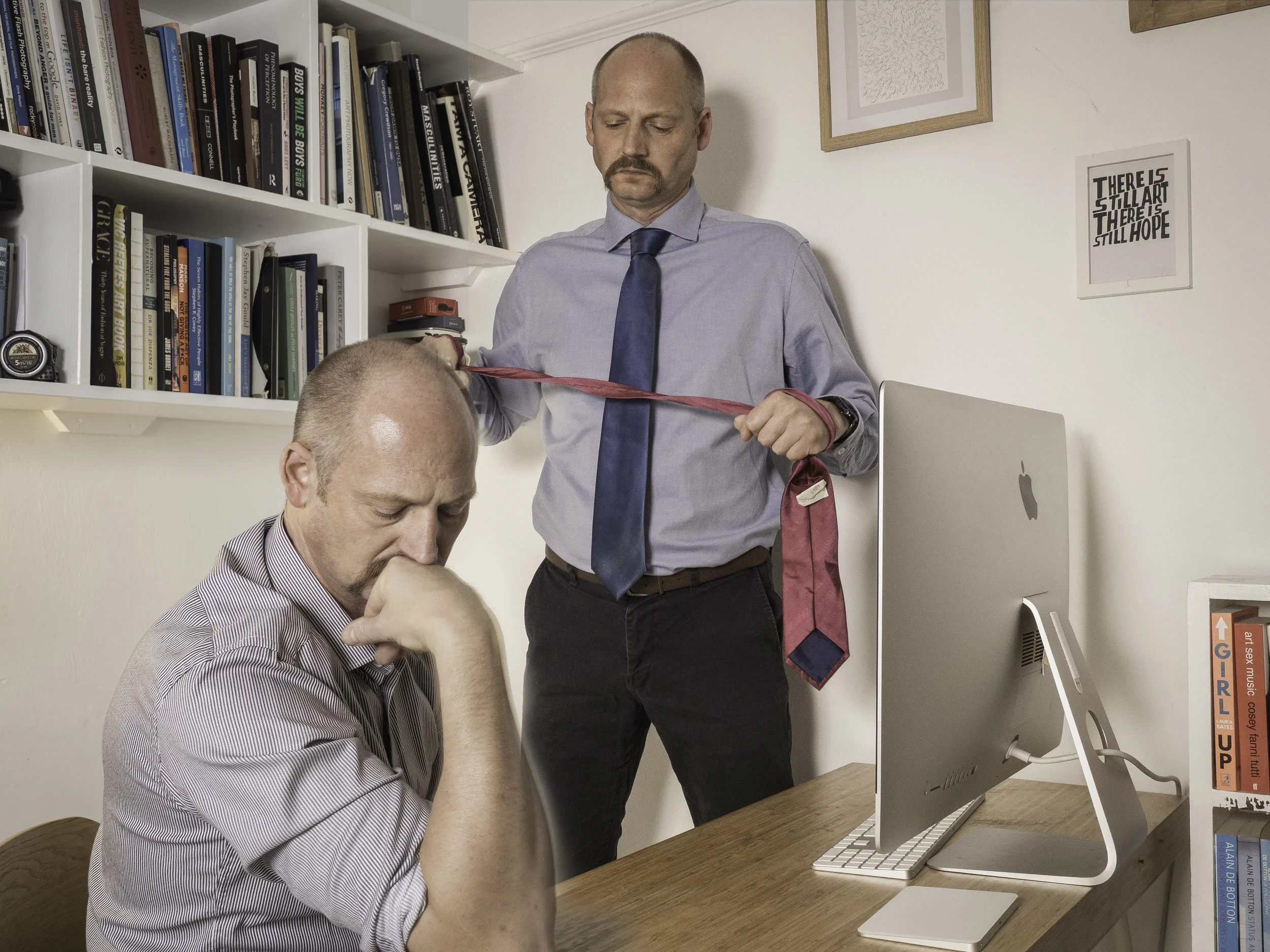
That lighting set up gave me the results below which I thought was going to be the final draft, having selected the subject images I particularly like from the numerous variations I shot, and carefully edited them together, blending both subjects into one scene.
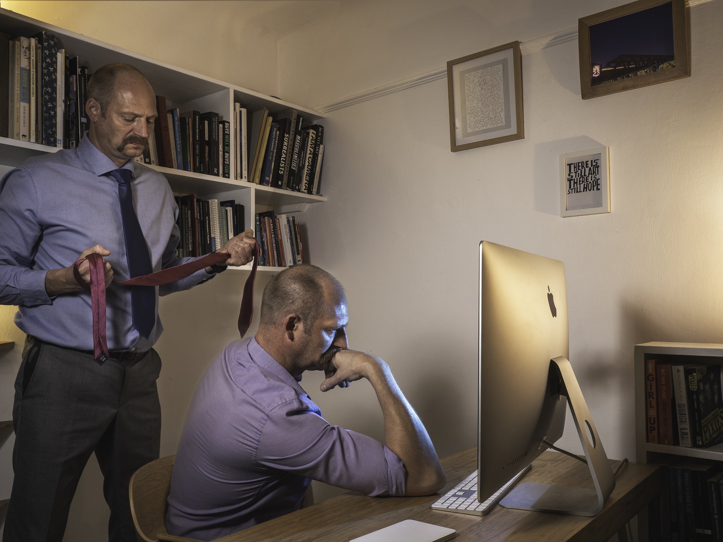
The (Over) Thinker - Third draft
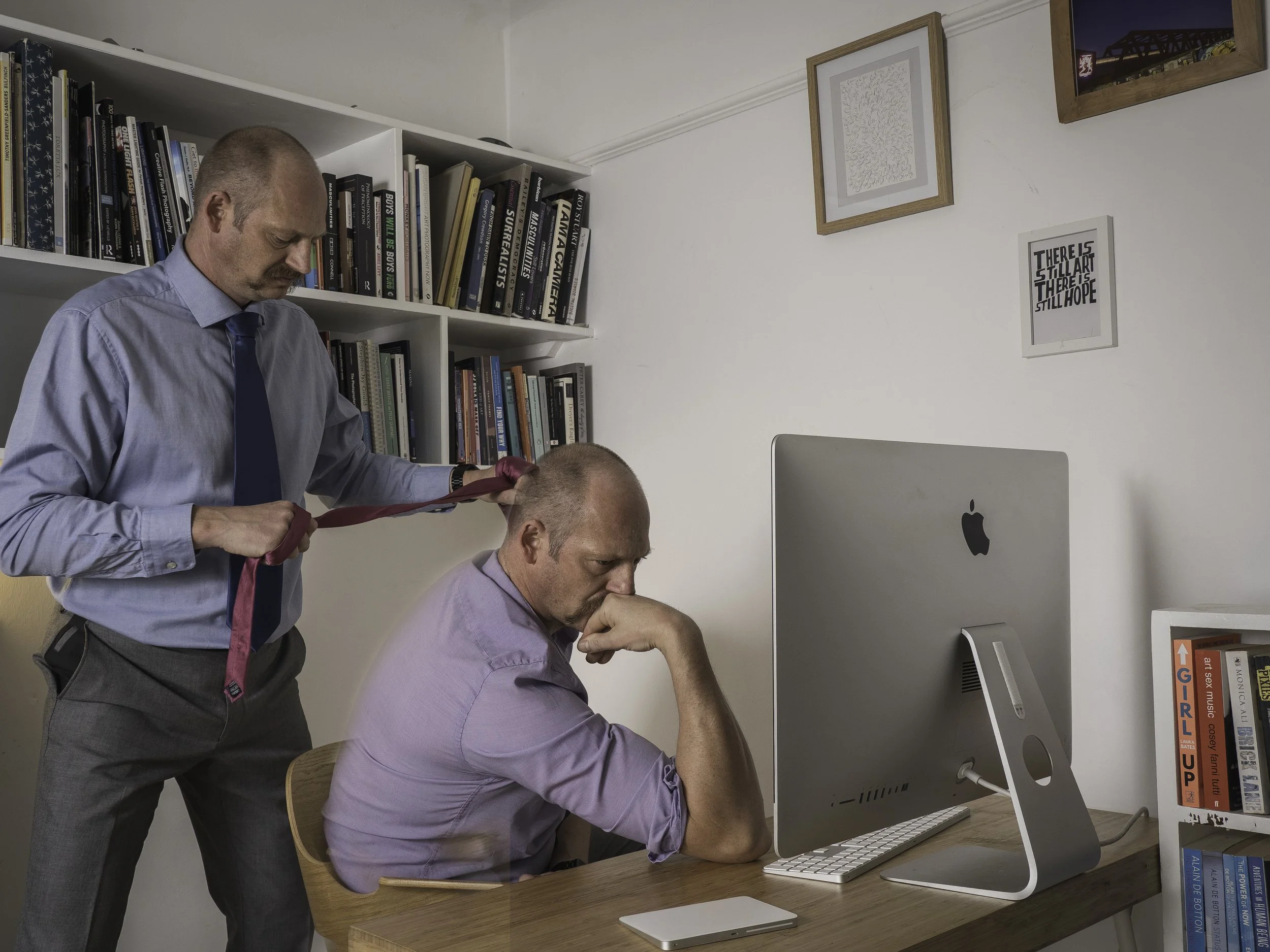
However, over a week or so of returning to the picture and considering its success or otherwise I still felt it was lacking in some way, not this time in the lighting which I was happy with. It took me some time to conclude that I felt it perhaps wasn’t engaging enough having the seated subject turned away from the camera and the standing one also looking elsewhere. I suspected there would be more impact if I used an image of the standing subject where he was making eye contact with the camera/viewer and fortunately had made a point of taking some such images during the shoot so that I could try an alternative edit without reshooting completely from scratch. Below is the resulting alternative image which I do indeed feel is more impactful for the reasons discussed. While the objects included consciously in the image such as the art on the wall and books representing the life of the mind and the computer which also has connotations of work, the wardrobe choices and colour of the clothes were of equal importance to me. The blues of the formally dressed latent strangler are conservative and in contemporary terms at least associated with maleness whereas the lilac shirt of the seated ruminator and his own magenta tie with which he is shortly to be strangled were intended to represent deviation from that conservative norm masculine performance. These elements were intended from the beginning, which is another reason I wanted to employ a more complex and multi-hued lighting arrangement, to ensure the language of colour was again a key part of the overall message.
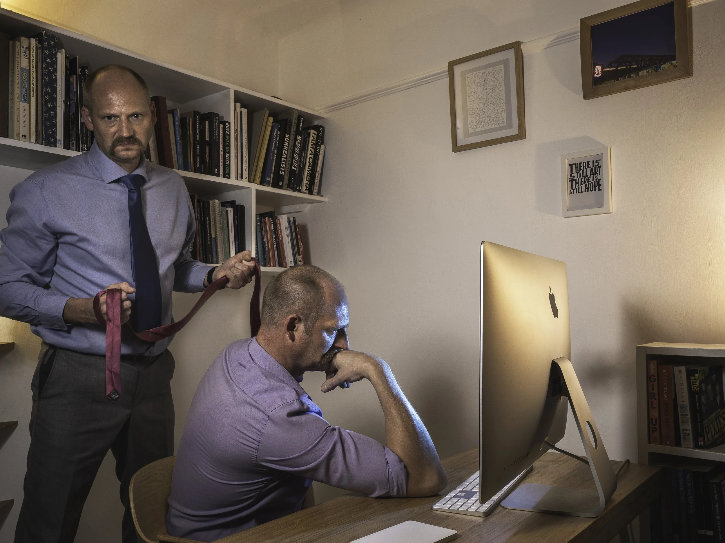
The (Over) Thinker - Final Image
The next image I wanted to make would be directly inspired by a painting, one of the only ones I was aware of to actually depict suicide and neatly it showed a method (poisoning/overdose) that I had not yet tried to represent. The painting is The Death of Chatterton by Henry Wallis from 1856. To my mind it is a beautiful painting not least because of the way the angelic subject is posed, Christ-like and lit by the late afternoon sun from the window above. While using myself as the subject I could not hope to create such an innocent and angelic persona as that of the young romantic poet Chatterton which the painting depicts, but I felt confident that I could recreate the feel of the painting, matching the lighting fairly closely and updating and replacing some of the key symbolic elements contemporary equivalents - the chest of torn manuscripts with the discarded laptop computer, the torn manuscript clutched in a death-grip with the broken smartphone, the snuffed candle with the not-illuminated lamp and the dropped poison bottle with a canister of pills of which too many had been ingested.
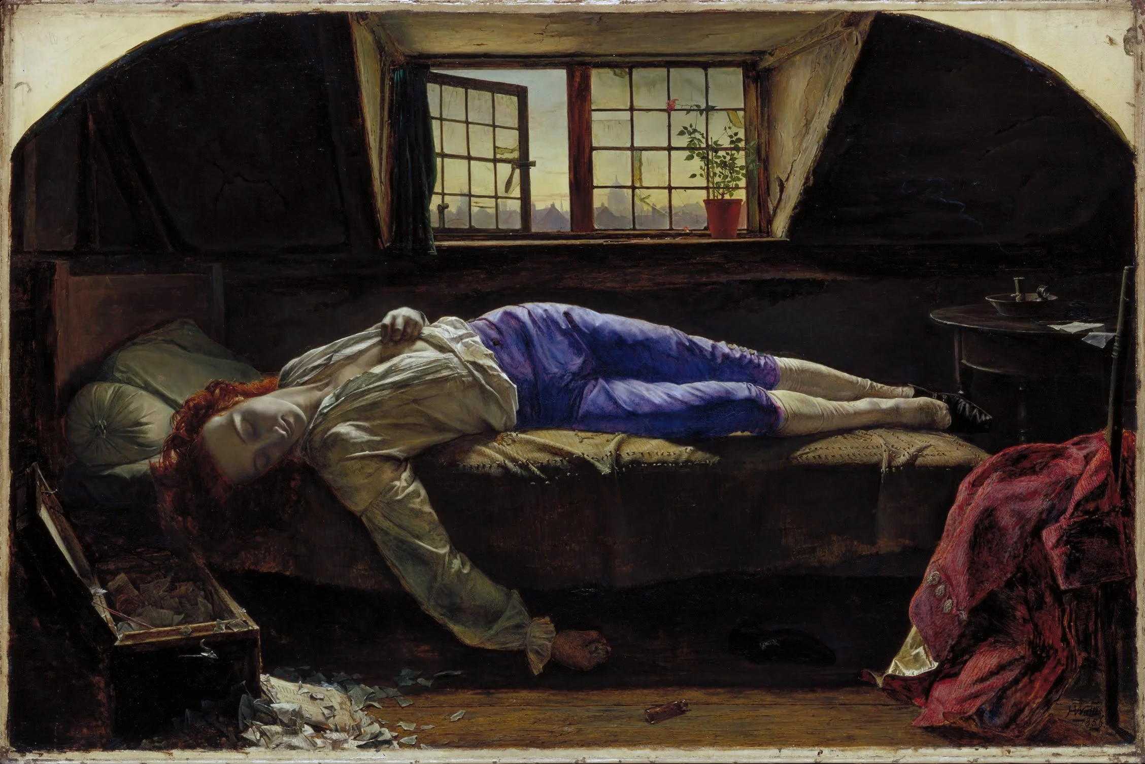
The Death of Chatterton, Henry Wallis, 1856
I wore a pair of navy blue chinos for the shoot but selectively pushed the colour towards purple when editing to better mimic the painting but also the indulgent palette of romanticism. I could not find a potted rose with a single, small flower which is a shame as I believe there is symbolic importance to this object in the image, just as there is with the snuffed-out candle with it’s dissipating wisp of smoke representing life dissembling.
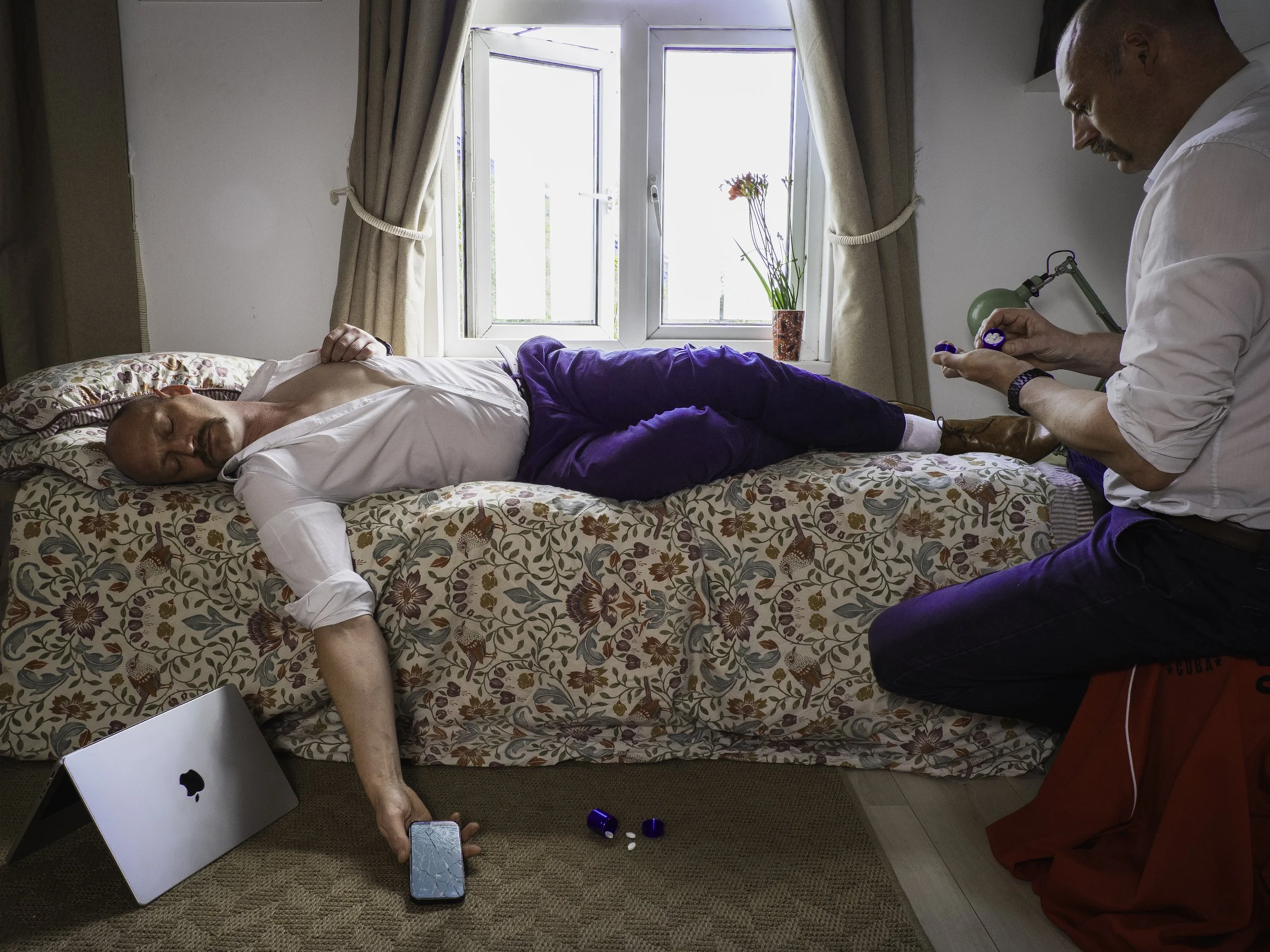
The Romantic - Final image
The next image I want to make in this series will depict a potential drowning. This time however my specific artistic reference is not a piece of visual art but a piece of poetry, Not Waving but Drowning by Stevie Smith from 1972. As I said before, my intention with these different images on the theme of male suicide is less about depicting crassly the various methods of self-destruction which someone might by employ and more about the different motivations and states of mind that might preempt the acts.
Not Waving but Drowning
Nobody heard him, the dead man,
But still he lay moaning:
I was much further out than you thought
And not waving but drowning.
Poor chap, he always loved larking
And now he’s dead
It must have been too cold for him his heart gave way,
They said.
Oh, no no no, it was too cold always
(Still the dead one lay moaning)
I was much too far out all my life
And not waving but drowning.
Stevie Smith, 1972

First draft - The Distant (Not Waving but Drowning)
Above is my first completed attempt to produce an image that represents the notion of being too distant, out of reach and drowning (both metaphorically and literally) and also with reference to Stevie Smith’s poem. The full set of proofs are below with the others.
Apart form the approximately 60 mile drive to the coast this was one of the most technically challenging shoots yet for various reasons. Although it is not particularly evident from the images it was an incredibly windy day, but at least the torrential rain I drove through on route seemed to have passed. I was also glad there was sufficient cloud in the sky to provide some visual interest and suppress slightly the ambient light making it more easily achievable to balance the sunlight behind the standing “larking” subject with the battery powered 600 W/S portable studio flash unit (set to full power) with which I lit the same subject from the opposite side. Unfortunately due to the high wind and time pressure with a constantly encroaching tide I neglected to photograph the lighting and camera set up which I would normally do.
It is probably clear that I also had difficulty positioning the subjects in the frame also. As with the other shoots I was controlling my camera remotely via my smartphone which showed me the view of the camera and allowed me to change settings (although I could not control the flash from my phone so had to go back and forth doing adjusting the angle and power manually by trial and error). Capturing images of the “drowning” subject was even more difficult. For several usually failed attempts of trying capture the right pose, I struggled to understand what was failing. Again, I was triggering the camera from my phone (with a slight timer delay) but in a waterproof case on a lanyard and before dropping it out of sight into the water. Eventually I concluded that the most likely issue was that when the phone went beneath the surface it lost connection with the camera. However, knowing I had a couple of images that I could use to create a first draft composite, and as the incoming tide was encroaching on my equipment decided to draw a line under the shoot and accept I’d likely need to reshoot with improvements maid from lessons learned.
While I do feel I will need to reshoot this image to try and ensure an eye-line connection between the two selves and a more appropriate expression on the drowning self, the final image is, I believe, effective as a proof of concept.
The next image I attempted hadn’t been in my original field of consideration for this project but life events brought about it’s relevance for exploration. I had recently gone through the prolonged process of assessment for ADHD and was officially given an affirmative diagnosis in late July 2025. As the various medication options for ADHD are stimulant pharmaceuticals, I was required to have my heart rate and blood pressure assessed.
I had already been alerted by my GP to the fact that my heart rate and blood pressure were high (and that I showed signs of a fatty liver) so it was not too surprising when I was told that I could not begin trialling ADHD meds until I had got my heart rate and blood pressure consistently under control to mitigate against the increased risk of heart failure. Indeed I went on to learn that if I did not significantly improve those critical stats by improving my health I might only have another ten years to live rather than the thirty-or-so I might expect if I made drastic lifestyle changes.
In principal I have always been concerned that in anglophone culture we too much value quantity of life over quality (which I see as a hangover from our Christian legacy) and is reason I am pro-choice for women when when it comes to abortion and sympathetic to assisted dying in appropriate circumstances. It therefore seemed like a logical step to create an image that represented a sort of soft, or slow suicide where the knowledge of self-harm was not deterrent enough for the subject to stop engaging in behaviour that was hastening the end of their life. When initially visualising the image I had imagined one subject being surrounded by the detritous of their unhealthy pleasures and suffering a heart-attack while the other self watched on indifferently. However during the two weeks I had to mull the construction of the image over, I ended up concluding that it would be more appropriate to have the innocent self (not gorging on the poisonous delights) to be the victim while the other remained oblivious. Also, after weighing up various options I had titled the image “The Indifferent” but eventually decided to go with “The Nihilist” because while I had previously thought this title might be too esoteric I ultimately felt it was more accurate.
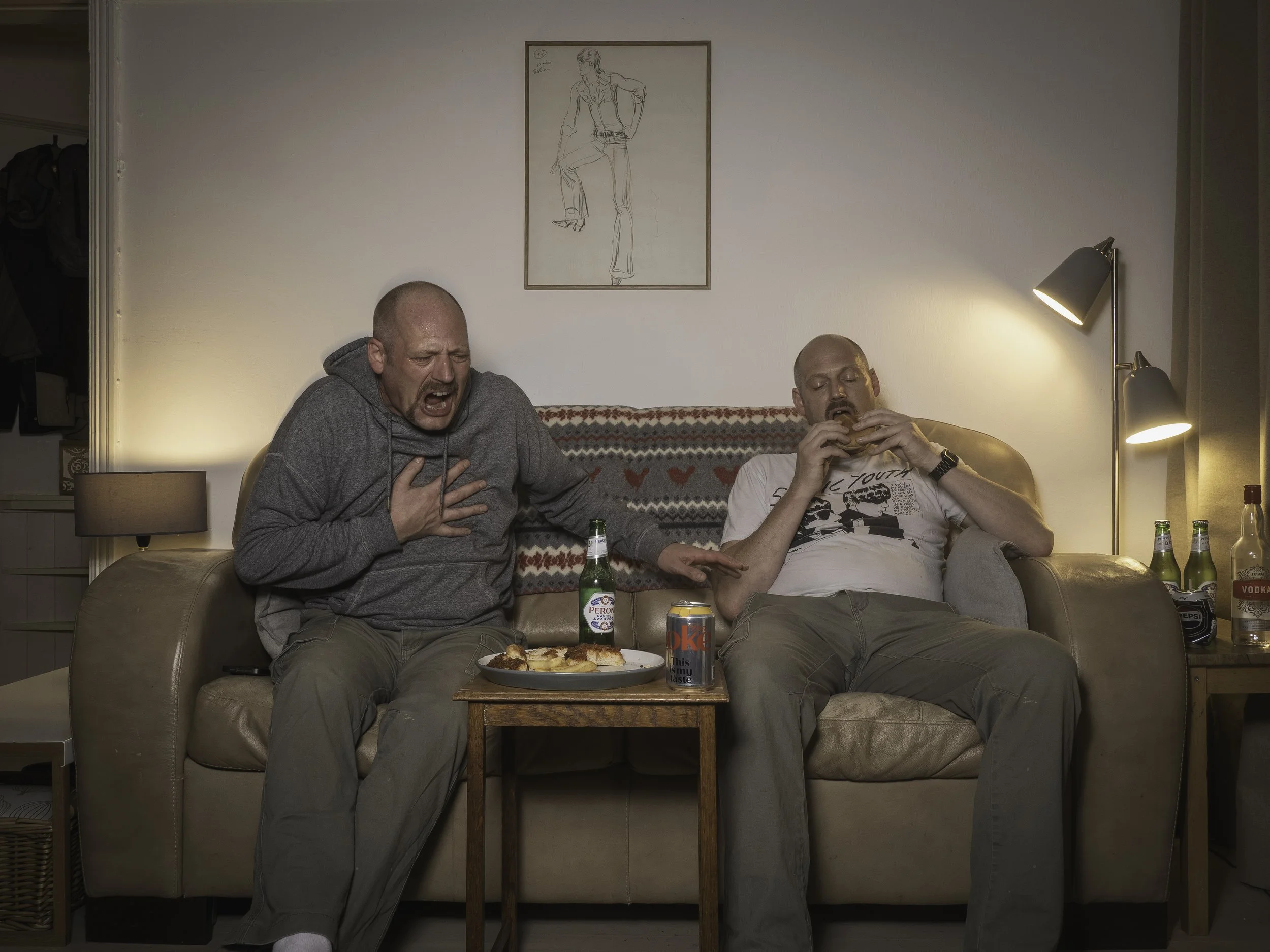
The Nihilist
Overall I feel that the images I have created for this project are successful but only up to a certain point. They were all shot with limited resources (and apart from one image, in my rented one-bedroom flat), without assistance so the production values are not as high as I would like them to be. For greater impact, higher production values and the potential for much further exposure and reach, I will now approach relevant charities for partnership/sponsorship and a variety of public figures and “celebrities” to feature in the images in the hope that the images can function as a campaign or part of a campaign to raise awareness and even funds for the issue and the partner charities.


